トップページは言わばサイトの顔みたいなもので、一瞬で目を引いて立ち止まらせる必要があると考えています。ヒーロー画像するだけでも十分ですが、画像の上にキャッチコピーを配置することで「お、このサイトいい感じ。もう少し見てみよう」と思わせることに繋がります。
SWELLだと画像配置とキャッチコピーを被せるだけなら標準機能で簡単にできます。
まずはそこからやってみましょう。
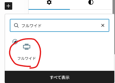
ヒーロー画像の配置
まず初めにフルワイドブロックを置きましょう。
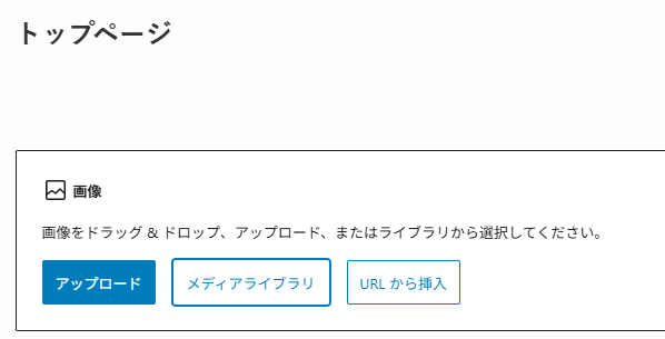
画像ブロックを置いて画像を選択しましょう。
画像の解像度は高めの方が綺麗に表示されるので、1000px以上のを使うと良いでしょう。
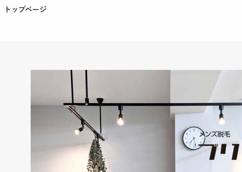
画像を配置しました。ここまではすんなりいくと思います。
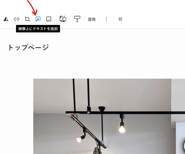
キャッチコピーを配置
配置した画像を選択し、”画像上にテキストを追加”をクリックします。
もちろん、そのまま文字を書き込んでもOKです。文字の色や大きさもSWELL標準機能で変更できますね。
ぼくは一段回ひねりたくて、文字の背景装飾やアニメーションを付けていきたいと思います。
ブロックを選択し、カスタムHTMLをクリックします。
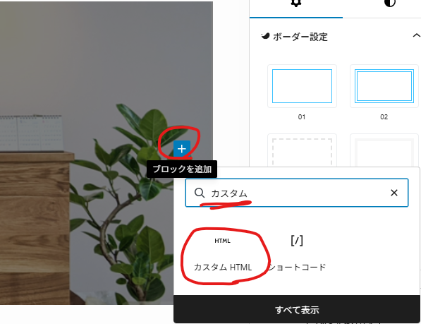
キャッチコピーと装飾のコードを書きます。
ここは説明すると大変なので、詳しく知りたい方はChatGPT・Gemini・Claudeなどに解説してもらってください。
<div class="fv-wrap">
<div class="circle circle1"></div>
<div class="circle circle2"></div>
<div class="catch-text">
<p>
その肌が、<br>
新しい自信になる。
</p>
</div>
</div>
<style>
/* ---------- 全体 ---------- */
.fv-wrap {
position: relative;
width: 100%;
height: 500px;
}
/* ---------- 円の基本スタイル ---------- */
.circle {
position: absolute;
border-radius: 50%;
top: 50%;
left: 50%;
transform: translate(-50%, -50%);
}
/* ---------- 円1(中央白線) ---------- */
.circle1 {
width: 550px;
height: 550px;
border: 1px solid rgba(255, 255, 255, 0.8);
z-index: 2;
opacity: 0;
animation: fadeCircle 1.4s ease-out forwards;
animation-delay: 2.0s;
}
/* ---------- 円2(右側グレー) ---------- */
.circle2 {
width: 550px;
height: 550px;
top: 53%;
transform: translate(calc(-50% + 20px), -50%); /* ← 統一済み */
background-color: rgba(70,70,70,0.55);
z-index: 1;
opacity: 0;
animation: fadeCircle2 1.6s ease-out forwards;
animation-delay: 2.5s;
}
/* ---------- キャッチコピー ---------- */
.catch-text {
width: 100%;
max-width: 600px;
position: absolute;
z-index: 3;
top: 50%;
left: 57%;
transform: translate(-60%, -50%);
color: #fff;
font-size: 38px;
font-weight: 600;
line-height: 1.4;
text-align: center;
opacity: 0;
animation: fadeTextFix 1.4s ease-out forwards;
animation-delay: 4.1s;
}
/* ---------- アニメーション ---------- */
@keyframes fadeCircle {
0% { opacity: 0; transform: translate(-50%, -50%) scale(0.9); }
100% { opacity: 1; transform: translate(-50%, -50%) scale(1); }
}
@keyframes fadeCircle2 {
0% {
opacity: 0;
transform: translate(calc(-50% + 20px), -50%) scale(0.9);
}
100% {
opacity: 1;
transform: translate(calc(-50% + 20px), -50%) scale(1);
}
}
@keyframes fadeTextFix {
0% { opacity: 0; }
100% { opacity: 1; }
}
/* ===============================
▼ レスポンシブ対応
=============================== */
/* タブレット(1024px 以下) */
@media (max-width: 1024px) {
.circle1, .circle2 { width: 380px; height: 380px; }
.catch-text { font-size: 25px; transform: translate(-55%, -50%); }
}
/* 小さめタブレット(768px 以下) */
@media (max-width: 768px) {
.circle1, .circle2 {
width: 300px;
height: 300px;
}
/* 左に寄りすぎ防止:中央から10pxだけ右 */
.circle2 {
top: 51%;
left: 48%;
transform: translate(calc(-51% + 10px), -50%);
}
.catch-text {
font-size: 20px;
width: 100%;
left: 50%;
transform: translate(-50%, -50%);
}
}
/* スマホ(480px 以下) */
@media (max-width: 480px) {
.circle1, .circle2 { width: 250px; height: 250px; }
.circle2 {
top: 51%;
left: 46%;
transform: translate(calc(-50% + 2px), -50%); }
.catch-text {
font-size: 17px;
width: 100%;
left: 50%;
transform: translate(-50%, -50%);
}
}
/* 超小型スマホ(360px 以下) */
@media (max-width: 360px) {
.circle1, .circle2 { width: 220px; height: 220px; }
.circle2 {
top: 51%;
left: 46%;
transform: translate(calc(-50% + 2px), -50%); }
.catch-text {
font-size: 15px;
}
}
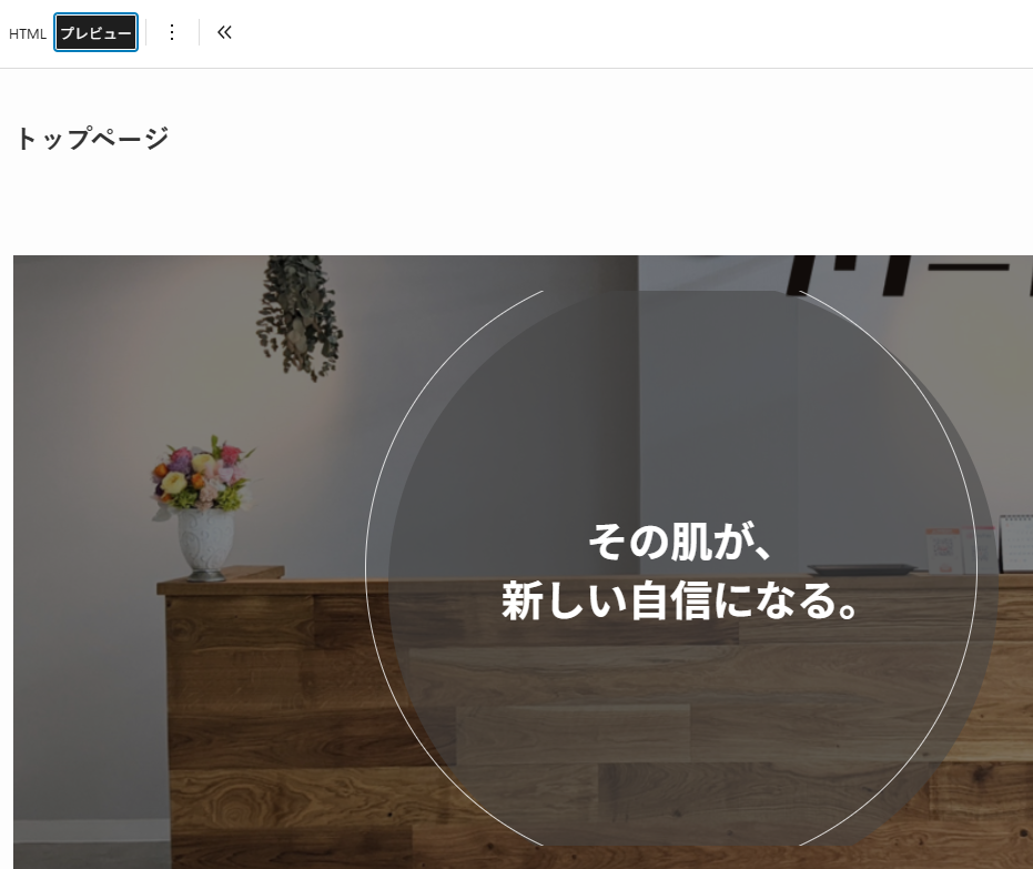
</style>プレビューするとこんなイメージになります。
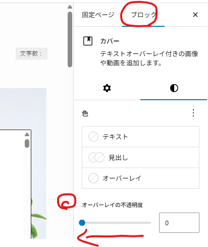
キャッチコピーの背景画像が暗いと感じたら、オーバーレイの不透明度を下げてください。
画像のサイズをモバイルで最適化する
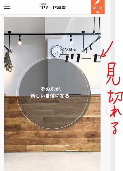
画像によっては、サービス名や店舗名を入れることもありますよね?
モバイルで表示するとこうして見切れてしまう場合があります。
タブレットやモバイルで最適な画像を表示させるには、カスタムCSSを適用します。いま編集しているページの下に行くと”カスタムCSS&JS”があります。
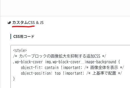
そこに、こちらのCSSコードを追記します。解説は割愛します。
<style>
/* カバーブロックの画像拡大を抑制する追加CSS */
.wp-block-cover img.wp-block-cover__image-background {
    object-fit: contain !important; /* 画像全体を表示 */
    object-position: top !important; /* 上基準で配置 */
}

/* TOPカバー画像の調整 */
/* ---------- カバーブロックの余白除去 ---------- */
.wp-block-cover.is-light {
    /* 高さをvwで固定せず、画像の比率(1:1)を保つ */
    min-height: auto !important;
    aspect-ratio: 1079 / 1080; /* 画像の実際のサイズを指定 */
    width: 100% !important;
    padding: 0 !important; /* SWELLのデフォルト余白を消去 */
}

.wp-block-cover img.wp-block-cover__image-background {
    /* containだと隙間が出るので、coverに戻して100%フィットさせる */
    object-fit: cover !important;
    width: 100% !important;
    height: 100% !important;
}

.fv-wrap {
    /* ここも親要素(cover)と同じ高さになるように設定 */
    height: 100%;
    min-height: inherit;
}

/* PC(1024px以上)の時は、今までの「迫力ある高さ」を維持する */
@media (min-width: 1024px) {
    .wp-block-cover.is-light {
        aspect-ratio: auto; /* PCでは比率固定を解除 */
        min-height: 900px !important;
    }
}
</style>
CSSを適用したあと、モバイルで表示させても画像がシュッとなりましたね?
”ブリーゼ湘南”の背景も上手く収まりました。
※キャッチコピーの文言は画像と異なる場合があります。
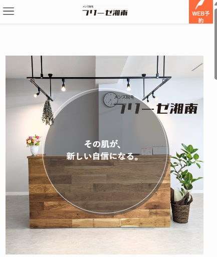
ぜひ、ブリーゼ湘南のサイトでも実際に見てみてください。
コメント